Sunday, April 26, 2020

Line/Texture/Pattern Assignment


Guggenheim Museum Frank Loyd Wright was a master of line and pattern in the buildings he designed. One of the most famous is the Solomon Guggenheim Museum in New York City.
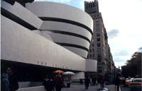


For this assignment, you will capture 15 images that explore line, texture, and pattern in the world around you.

Line


In this photograph the window frame literally frames the image of the patterns on the roof. Using one object to frame another is a great way to add depth to your photos. Experiment with a frame that adds contrast in terms of light or texture when compared with your subject.


This photograph used the macro function of the camera to capture the texture of an everyday object, tire tread. The image was enhanced with more contrast and the sharpen filter. You'll find lots of examples of lines, patterns and texture on cars. The macro setting on your camera will let you focus on objects only inches away.


Implied Lines

This photograph uses objects in a line. You'll have to scout around for these images but keep your photographic mind's eye open and you'll find them!


Texture

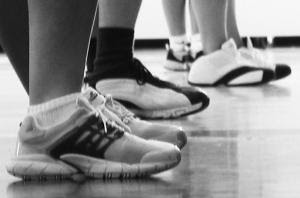
In these images from Mark Moody's website, we see the macro used on the crab's eyes. There is contrast in color as well. Notice how the angle of the shot creates an impression of size. This photo would not have the same impact if it didn't use hard lighting.


Pattern
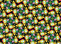
A Pattern is a repeated decorative design or a sequence of images or shapes regularly found in objects or on surfaces.

Assignment:

You will photograph
a total of 15 photos:

* 5 of these photos must demonstrate Line
* 5 of these photos must demonstrate Texture
* 5 of these photos must demonstrate Pattern

Eye Candy! - You're looking for images that will catch your eye. You'll find examples of lines, patterns and texture in everyday places.  Try and fill up the entire frame of your photograph with those lines, textures, or patterns. Use them to create strong images with a lot of contrast! 

You'll upload each photo independently onto Canvas.  Again, no need to name these photos when uploading to Canvas.  Your photos will be identified by the student who uploads them (you).

This assignment is due for you on by the end of class on Wednesday, May 6th.

Sunday, March 29, 2020

Learning Opportunity Part 1 - Photographic Examples of the Elements and Principles of Art and Design Used in Photography

Below is a link to photographic examples, and the definitions for each of the Elements and Principles of Art and Design.  Study these carefully, as they are a big portion of your current "learning opportunity"

Click HERE to see some examples of how these Elements and Principles are utilized in photography.

The definitions are below:

Elements of Design

Line - is a mark on a surface that describes a shape or outline. It can create texture and can be thick and thin.  Types of line can include actual, implied, vertical, horizontal, diagonal and contour lines.

Color - refers to specific hues and has 3 properties, Chroma, Intensity and Value.  The color wheel is a way of showing the chromatic scale in a circle using all the colors made with the primary triad.  Complimentary pairs can produce dull and neutral color.

Texture - is about surface quality either tactile or visual. Texture can be real or implied by different uses of media. It is the degree of roughness or smoothness in objects.

Shape - is a 2-dimensional line with no form or thickness. Shapes are flat and can be grouped into two categories, geometric and organic.

Form - is a 3-dimensional object having volume and thickness. It is the illusion of a 3-D effect that can be implied with the use of light and shading techniques. Form can be viewed from many angles.

Value - is the degree of light and dark in a design. It is the contrast between black and white and all the tones in between. Value can be used with color as well as black and white. Contrast is the extreme changes between values.

Space - A 3-dimensional volume that can be empty or filled with objects.  It has width, height, and depth.

Principles of Compositional Design

The principles of design are the recipe for a good work of art. The principles combine the elements to create an aesthetic placement of things that will produce a good design.

Emphasis - is an area that first attracts attention in a composition. This area is more important when compared to the other objects or elements in a composition.  This can be by contrast of values, more colors, and placement in the format.

Balance - is a feeling of visual equality in shape, form, value, color, etc.  Balance can be symmetrical or evenly balanced or asymmetrical and un-evenly balanced.  Objects, values, colors, textures, shapes, forms, etc., can be used in creating a balance in a composition.

Unity - brings together a composition with similar units.  If your composition was using wavy lines and organic shapes you would stay with those types of lines and not put in just one geometric shape. (Notice how similar Harmony is to Unity - some sources list both terms)

Contrast - offers some change in value creating a visual discord in a composition. Contrast shows the difference between shapes and can be used as a background to bring objects out and forward in a design. It can also be used to create an area of emphasis.

Movement - is a visual flow through the composition. It can be the suggestion of motion in a design as you move from object to object by way of placement and position.  Directional movement can be created with a value pattern. It is with the placement of dark and light areas that you can move your attention through the format.

Rhythm - is a movement in which some elements recurs regularly. Like a dance it will have a flow of objects that will seem to be like the beat of music.

Pattern - is the planned or random repetition that occurs in nature and in art.

Learning Opportunity Part 2 - Chart of Emotions

Study the Chart of Emotions Below

  • Write down any and all emotions you have been feeling during these past few weeks while the Covid-19 virus has taken a hold of our everyday lives.
  • Do you feel the colors used to represent these emotions are accurately? If not, what colors would you use?  Make note of it.  You'll be using color to possibly represent the emotions you wrote down.


Learning Opportunity Part 3 - Photographic Challenge: Demonstrate Photographic Examples that Represent The Emotions You Are Going Through

For this photographic Challenge you can use any camera that is available to you or find images online that you can screenshot and save to your computer.

Use the Elements and Principles of Art and Design, and Color to visually represent any of the emotions that you wrote down in Part 2 of this exercise.

Photographic Challenge:
  • Turn in 2 photographs that each represent one emotion. 
  • Each photo must demonstrate any 1 Element and 1 Principle 
  • Each photo must use a Color to represent each emotion you are trying to portray


Wednesday, February 26, 2020

The 6 Rules of Photographic Composition

Please click on the link to this website and read through ALL of the 'Guidelines for Beginning Photographic Composition.'
You will use these guidelines to critique your classmate's photos.
This material will also be included on your first test.

http://asp.photo.free.fr/Composition/photoProgramCompMainClass

For the "6 Rules of Composition" assignment you will be required take 10 examples of each of the 6 Rules.
  1. Simplicity
  2. Rule of Thirds
  3. Leading Lines
  4. Framing
  5. Balance
  6. Color Contrast - (Click on this link to learn more about Color Contrast, also known as Complementary Color)
Details: 60 photos in total, but you CAN use the same photo more than once if it can be categorized in more than one Rule of Photographic Composition.  However, you CANNOT use the same Object or Subject in more than 1 photo in any of the 6 categories. 

6 Contact Sheets: Each is 2 Columns and 5 Rows

Naming Convention: _simplicity, _ruleof3rds, _leadinglines, _framing, _balance, _colorcontrast

Date Date: End of Class on Thursday/Friday, March 12/13th.

Your grade for this assignment will be based on the following factors: 
  • Completion of each image turned in on a contact sheet and properly labeled with each rule of composition.
  • Turned in on time (formative)
  • The quality and creativity of your 60 best images
  • Your ability to use correct Photoshop file compression and submission procedures

Friday, January 31, 2020

Welcome to Digital Photography 1

I am happy to welcome you to Digital Photography 1.

During the course of this semester, it is my intention to expand your knowledge of photographic composition, hone your digital camera skills, and enhance your digital images using iPhoto and Photoshop CS-CC. This website is designed to help keep you informed on all projects, assigned readings, and updates on class discussions over the course of the semester. Whenever you have any questions regarding Digital Photography 1 assignments or topics, you can first look on this website for details. If your questions remain unanswered, feel free to email me at marty.ballew@shorelineschools.org.

Please return all materials that require a Parental/Guardian signature, and the $20 Lab Fee to me as soon as possible. Students will not have access to cameras and camera equipment until the Lab Fee, Academic Plan and Out of Class Permission forms are signed and returned.

Wednesday, October 16, 2019

What Elements and Principles, or Rules of Photographic Composition Apply?

Take a moment to look through these award winning photos of nature and wildlife.  What What Elements and Principles, or Rules of Photographic Composition apply?

https://www.cnn.com/travel/article/wildlife-photographer-of-the-year-2019-winners-scli-intl/index.html